Personally I think design is very important. It attracts attention, it builds (or tears away) credibility, and can be the differentiator between competitors.
We’re worried about podcast artwork. Does it matter? And what should you be worried about?
I’ve helped several podcasts launch and had to evaluate and help them come up with album art that worked. I didn’t want to blindly guess so I decided to dig in and figure out what makes a great podcast cover?
I evaluated the top 50 podcast’s album art in Itunes in August of 2014 and this is what I learned.
Here is what works
- Lot’s of whitespace
- Face that takes up most of the cover
- solid background color (orange, black, white, pink)
- Giant icon
- distinct and solid lines
Doesn’t work
- Medium size faces
- gradients / lot’s of colors
- more than 5 words for a tagline (none in the top 25 have this)
- Anything busy
- Pictures
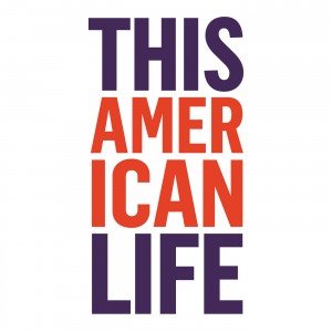
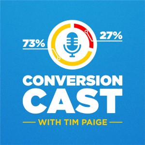
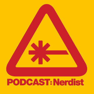
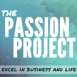
Here are several of my favorite covers I think should be “imitated”
If you have one you think should be added make sure to let me know in the comments below!


What you need to know about podcast art
It definitely matters. You can easily attract attention by creating a simple, bold, piece of art. It’s a way to differentiate yourself between everyone who is trying to put a small picture of their face on the cover.
Simply open up Itunes. Pull up the top podcasts. And squint your eyes. You’ll see some podcast art stands out. That is what you’re going for.
It means you’re going to get more clicks. As simple as that.